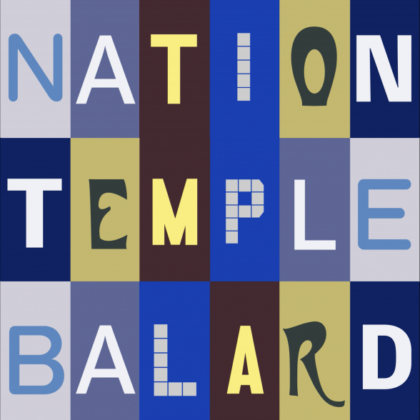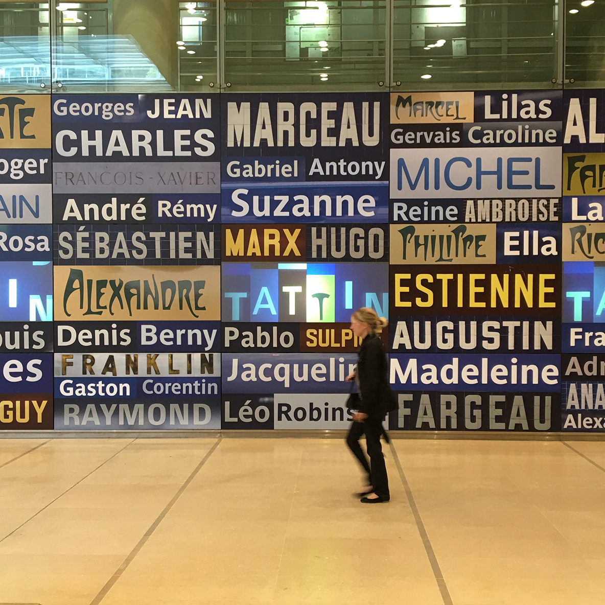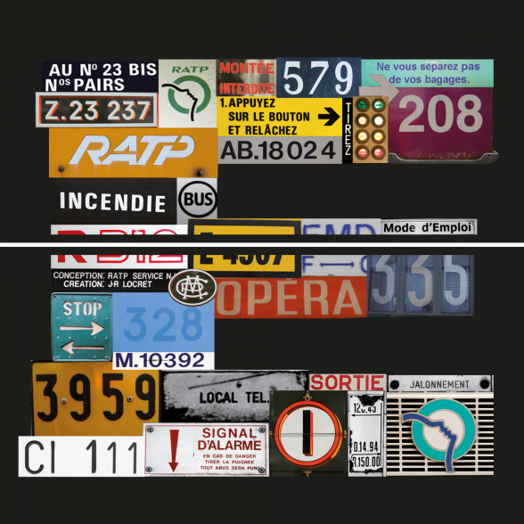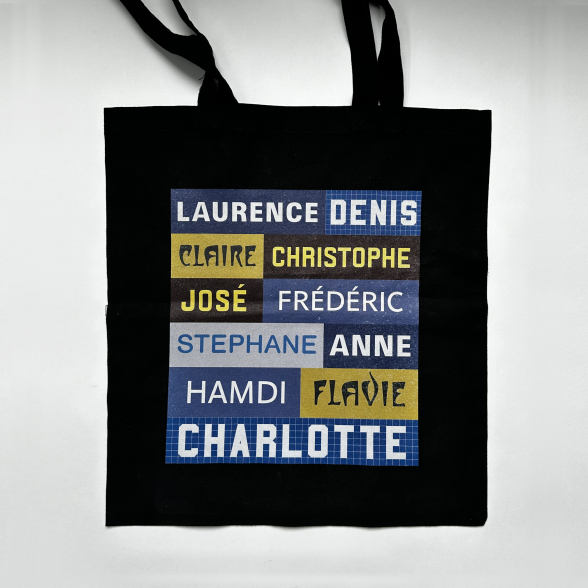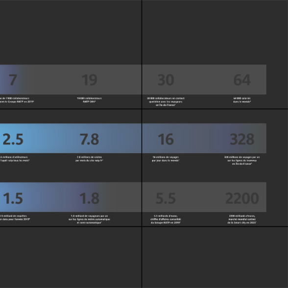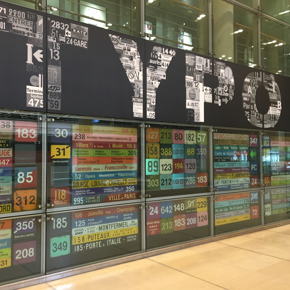
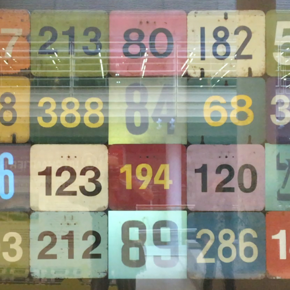
The signature of a city, such as Paris or London, is above all to be found in its transport systems, with all their graphic indications. With this in mind, and with the help of the RATP's incredible heritage collection, we have put together the ‘typography’ exhibition, which looks at the culture of signs on Parisian buses and underground trains. By first listing all the first names used in station names, we can see the extent to which typography varies from one era to another and from one medium to another. In the early days of the metro, there was no graphic charter, so Hector Guimard's distinctive glyph was used in certain places, while at the same time ceramic artists adapted the letters to the small white and blue tiles that were are so distinctive of the Paris metro, depending on the length of the station names. It was not until the end of the 20th century that the RATP adopted a dedicated typeface: la Parisine. Nevertheless, in the interests of preserving the city's heritage, many metro stations have kept their original typefaces.